skip to main |
skip to sidebar
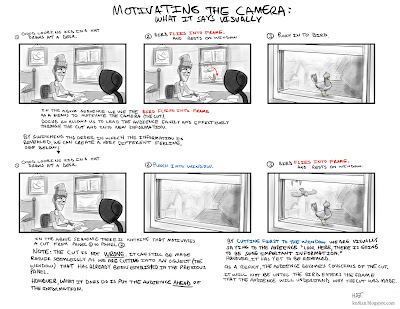
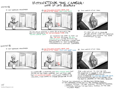
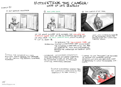
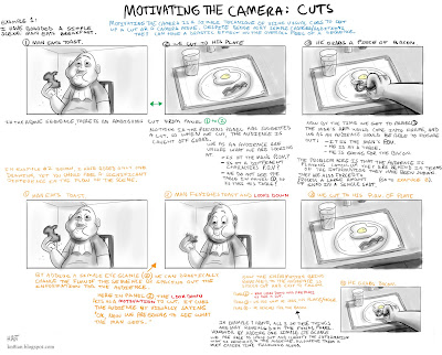
Motivating the Camera: Part 2.Continuing with the previous post, these examples revolve too around motivating the camera, however explores more "what they are saying visually". The next three examples are all slight variations of the same scene, each exploring a different approach in regards to the progression of information that is revealed to the audience, and consequently the effect it has on them. Please note that none of these examples are any more "right" than any other. They are merely different takes on the same scene. Their purpose is to show how slight variations in storyboards (and ultimately film) can produce vastly differing ideas/moods. Ultimately, it would all depend on what the script calls for or what is necessary of the scene to determine which of the following (if any) would be suitable.
 I think the most important thing to take away from this concept of 'motivating the camera', is just to try and be conscious of the decisions you are making in your storyboards. Try to understand what you are actually saying visually, what information you are revealing to the audience (and when) and what effect it will have on them. Thinking about these things as you board can really help enhance a sequence and 'sell' an idea in the storyboard stage.On a side note: None of these tips/theories/methods I've discussed are "rules". They are by no means absolute. There are no 'right' or 'wrongs' with storyboarding, as I've stated before, simply ways that work better than others at achieving desired responses. As much as I use these principles and incorporate them into my own sequences, I find myself quite frequently deviating, or cheating, or bending these ideas. I rely much more on the 'feeling' of a sequence as I board. Boarding panels and flipping through them to see how I 'feel' watching it, to see if the cuts are smooth, or if something doesn't 'feel' right. So take these tips for what they are worth, simply tips, tricks and principles I have found to be sucessful.
-Hat
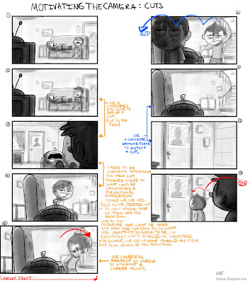
The next couple posts revolve around 'motivating the camera'. What is motivating the camera you might ask? Good question, you get a gold star.*Motivating the camera is a simple technique of using visual cues to set up a cut or camera-move and in doing so, ease the audience into a new shot or new information.
Below is a simple example of how utilizing the above theory can have a huge influence on the overall feel/continuity of a sequence.
I think I made it a bit overly-complicated. Just look through each of the examples and feel the difference.
Basically: Use a character's eye line to motivate a cut. It helps ease the audience through the cut and into new information. (While also putting us directly in the character's shoes)
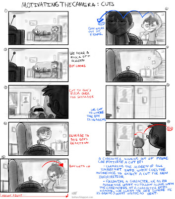
There are many other ways to motivate the camera. Below is a short sequence I've boarded out with various examples all strung together. The idea is to create as much continuity within the sequence as possible, making everything clear and easy to follow.
 Below I have pointed out the specific methods used to motivate the camera.
 So as per the above sequence, ways to motivate the camera;- Using a Character's eyeline/P.O.V.
- Having a character move on screen and adjusting the camera accordingly.
- Having a character exit frame.
There are other ways not represented in the above example, for instance;
- Having a character enter frame. (This will be illustrated in a future tip sheet.)
I think ultimately what it comes down to, specifically for 'cutting', is the fact that a 'cut' is not natural, it doesn't happen in real life (unless you take really long blinks). Obviously we have seen enough film/television that we are accustomed to 'cutting', nevertheless, anything you can do to smooth out the transition will only help create and maintain the continuity of your sequence.
To be continued shortly...
* Gold stars are neither gold nor stars and consist almost entirely of your imagination.
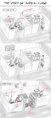
This is a quick little comic retelling I did of a recent monumental event to transpire at the studio.
As mayor of super-cube my responsibilities include:
- making of the mayoral crown
- wearing of the mayoral crown
Super-cube is the greatest idea I've ever had.
-Mayor McJewburger
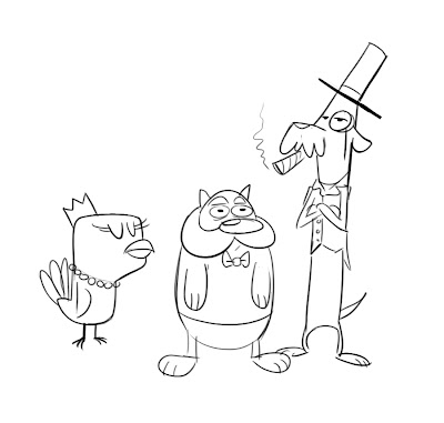 There was something about rich pets that I thought was funny.