skip to main |
skip to sidebar
Sum more Scratch doodles. This time I copied a lot of David Gemmill's stuff. He's awesome, you should check out his stuff. _Hat
_Hat
I call this one 'Bare Bear Underwear' After drawing it, I realized I really want that hat.-Hat
Cold feet; Earthy;
 -Hat
-Hat
I recently struck up an online conversation with Han, an aspiring animator/artist. She just posted her first pass at storyboarding on her blog, which I was thoroughly impressed with (without question better than any of my first few attempts).
I had some advice for her, primarily some principles she could look to incorporate into her boards as she moves forward, that I think will really help take her sequences to the next level. She was kind enough to allow me to post my notes here, so that others could benefit and learn from her work!
To illustrate the principles and techniques, I took a single panel from her sequence and drew over it. I gradually built up a new panel using hers as a starting point.
(The entire sequence can be seen on her blog, however for the sake of clarity I chose to focus on one panel.)
1. ORIGINAL PANEL FROM HAN'S SEQUENCE: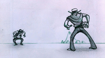 Conceptually, it is a good. -She has clearly established a screen relationship between two characters (left and right). -Indicated an envirment (the mountain range in the background)-Suggested a certain degree of depth.My main note, push it! push it good! Push the depth! Push the background! Take the concept of this shot and push it to find a more interesting and compelling compostition.
2. DRAW YOUR GRIDS!I started my redraw with a horizon line and laying down a grid.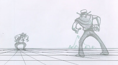 Laying down your grid is something that's been pounded into my head by almost every feature board artist I've ever worked with. It'll help clarify your depth, and can be used as a guide for incorporating mid/forground elements (illustrated in Step 5.)Trust me, lay down your grids, it'll help!
3. PUSH THE DEPTHIn her original panel, there is a lot of empty space around the characters, not particularly interesting visually. I drew over the characters, using my grid as a guide, and tried to push the depth. 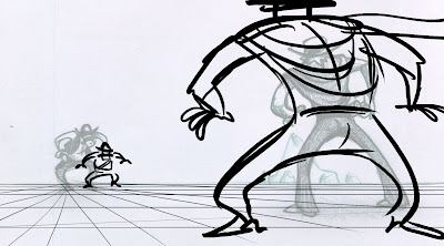 By pushing the depth, bringing one character closer and pushing one further away, you can create a much more engaging composition, as well as utlizing the real estate of the panel more effectively.4. USE THE BACKGROUND TO ENHANCE THE COMPOSITIONYou can use background elements to enhance a composition and direct the eye.
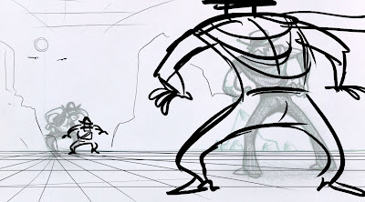 The important information in the above panel is the charatcers, so everything else in the composition should support that. Keeping that in mind, we can use mountain ranges in the background to help lead the eye to the character.5. POPULATE THE MID-GROUNDPut some junk in the mid-ground.
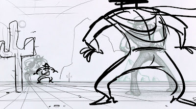 Populating the mid-ground can help in a few ways: -Further help define the enviroment -Help push the depth by incorporating over-lapping elements as well as visual depth cues (things getting smaller as they recede)6. A LITTLE SHADING GOES A LONG WAYIn the original panel the shading was a bit too detailed yet oddly unspecific. You can simplify the shading by thinking about it in terms of foreground, midground and background.
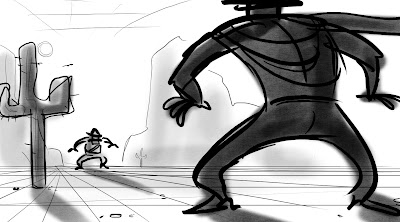 I did a quick shade pass over the panel using each object's relative position in the composition, how close/far away it is from us, and shaded accordingly.We can also use shadows to help direct the eye (just like the background) by having them point towards other important information.Below is a gif of the progression so you can see how being concious of these principles while your boarding can really help enhance your work. UPDATE:(You may need to click on it to see it animate)
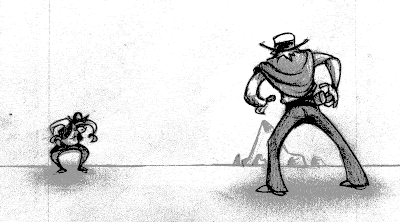 With storyboarding it is just a matter of getting sequences under your belt, the more you board, the better you get, plain and simple. Don't be discouraged if you don't see immediate improvement. It takes time for these principles to become second nature, the most important thing is that you are aware of them and how they can affect your work.Han is off to an amazing start, I can't wait to see where she goes from here!A big thanks to Han for allowing me to post this here. If you've taken anything away from this little break down, please visit Han's blog and thank her! It wouldn't have been possible without her hard work and generosity.-Hat
I was honored when Jeff Snow asked me to come up with today's Bi-Daily theme. I felt pressured to come up with an awesome theme, and then it hit me in the shower... "water pressure".
Below is my submission.
Perhaps one of my more cerebral contributions. check out
;
Dave PJeff SnowAlso a whole slew of Bi-Dailies from Steve Macleod.-Hat

See other sour drawings;Dave PJeff Snow
Today's theme (technically yesterday's): Pamper Check out all the others yo;Dave PJenny LerewJeff Snow
Normally I try and spend a little extra time on these bi-daily drawlings, to make em look nice, because quite frankly everyone else doing them is super awesome and their drawings are amazing, but I cranked this one out pretty quickly.
Dig in.
-Hat


 Conceptually, it is a good.
  Laying down your grid is something that's been pounded into my head by almost every feature board artist I've ever worked with. It'll help clarify your depth, and can be used as a guide for incorporating mid/forground elements (illustrated in Step 5.)
 By pushing the depth, bringing one character closer and pushing one further away, you can create a much more engaging composition, as well as utlizing the real estate of the panel more effectively.
 The important information in the above panel is the charatcers, so everything else in the composition should support that. Keeping that in mind, we can use mountain ranges in the background to help lead the eye to the character.
 Populating the mid-ground can help in a few ways:
 I did a quick shade pass over the panel using each object's relative position in the composition, how close/far away it is from us, and shaded accordingly.
 With storyboarding it is just a matter of getting sequences under your belt, the more you board, the better you get, plain and simple. Don't be discouraged if you don't see immediate improvement. It takes time for these principles to become second nature, the most important thing is that you are aware of them and how they can affect your work.
 check out;
 Check out all the others yo;