Tuesday, December 21, 2010
Monday, December 20, 2010
Tuesday, December 14, 2010
MANNY AND KHAN DOODLES
Monday, December 13, 2010
Wednesday, December 8, 2010
BIANCA-LLAMA AND BEAVER BOY 2
Tuesday, December 7, 2010
BIANCA-LLAMA AND BEAVER BOY!
Sunday, December 5, 2010
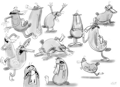
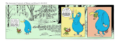
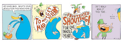
MANNY AND KHAN COMIC STRIPS- VOL. 2
A few more M&K strips. We actually made these about a year ago with the intentions of creating a weekly comic, lest me and Joey got busy with other shtuff... But Joey did such a kick-ass job inking and coloring these, I feel obligated to post them. And with the impending end of the calendar year it feels like a good time seeing as how the first two strips deal with Manny and Khan's new years resolutions;
 Hope you enjoyed the antics of these idiots.
_Hat


 Hope you enjoyed the antics of these idiots.
_Hat
Friday, December 3, 2010
Wednesday, December 1, 2010
Saturday, November 27, 2010
DOODLE DUMP
I was talkin to Joey about a little project he's workin on, when I realized I hadn't really sat down and just 'drawn' in a long while. Doin boards for a studio takes up most of my time, but I was inspired by Joey to sit down and draw. Eventually I ended up with these three characters below.
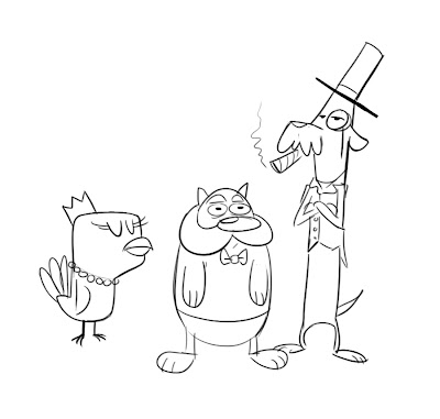 There was something about rich pets that I thought was funny.
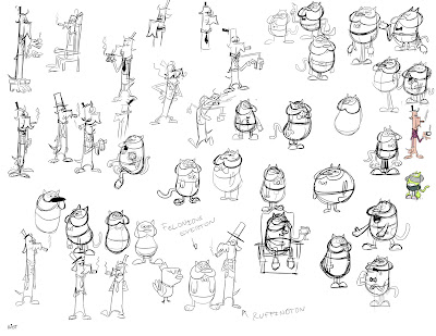
I Made a comic strip with a couple of them.

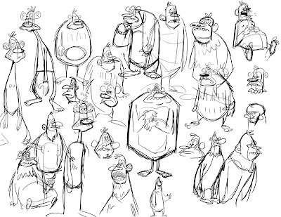
Below are some yeti doodles I did for Joey... you can never have too many yetis. You should check out his blog to see some of the awesome stuff he's doing.
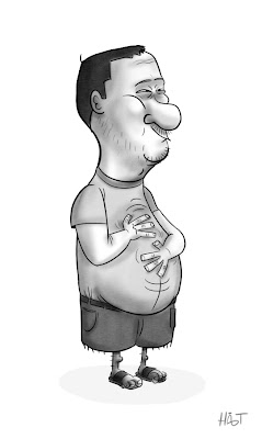
Lasty, a caricature I did of our Head-of-Story of Mad3, Rob Koo. He has a blog, but it's mostly just pictures of his plants and fish.
Peace
-Hat
Oh yeah, my old high school did an interview with me recently, and posted it on their website. If anyone is interested in hearing me talk about my life's journey thus far check out the video below. If not, DO NOT WATCH THE VIDEO, you have been warned.
 There was something about rich pets that I thought was funny.
I Made a comic strip with a couple of them.

Below are some yeti doodles I did for Joey... you can never have too many yetis. You should check out his blog to see some of the awesome stuff he's doing.

Lasty, a caricature I did of our Head-of-Story of Mad3, Rob Koo. He has a blog, but it's mostly just pictures of his plants and fish.

Peace
-Hat
Oh yeah, my old high school did an interview with me recently, and posted it on their website. If anyone is interested in hearing me talk about my life's journey thus far check out the video below. If not, DO NOT WATCH THE VIDEO, you have been warned.
Thursday, November 18, 2010
STUFF I'VE LEARNED ABOUT STORYBOARDING: EPISODE #5
Motivating the Camera: Part 2.
Continuing with the previous post, these examples revolve too around motivating the camera, however explores more "what they are saying visually".
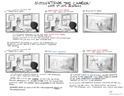
The next three examples are all slight variations of the same scene, each exploring a different approach in regards to the progression of information that is revealed to the audience, and consequently the effect it has on them. Please note that none of these examples are any more "right" than any other. They are merely different takes on the same scene. Their purpose is to show how slight variations in storyboards (and ultimately film) can produce vastly differing ideas/moods. Ultimately, it would all depend on what the script calls for or what is necessary of the scene to determine which of the following (if any) would be suitable.
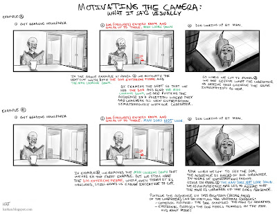
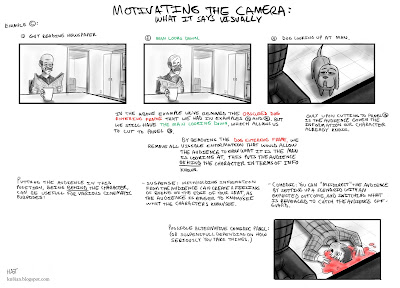
I think the most important thing to take away from this concept of 'motivating the camera', is just to try and be conscious of the decisions you are making in your storyboards. Try to understand what you are actually saying visually, what information you are revealing to the audience (and when) and what effect it will have on them. Thinking about these things as you board can really help enhance a sequence and 'sell' an idea in the storyboard stage.
On a side note: None of these tips/theories/methods I've discussed are "rules". They are by no means absolute. There are no 'right' or 'wrongs' with storyboarding, as I've stated before, simply ways that work better than others at achieving desired responses. As much as I use these principles and incorporate them into my own sequences, I find myself quite frequently deviating, or cheating, or bending these ideas. I rely much more on the 'feeling' of a sequence as I board. Boarding panels and flipping through them to see how I 'feel' watching it, to see if the cuts are smooth, or if something doesn't 'feel' right. So take these tips for what they are worth, simply tips, tricks and principles I have found to be sucessful.
-Hat
Continuing with the previous post, these examples revolve too around motivating the camera, however explores more "what they are saying visually".

The next three examples are all slight variations of the same scene, each exploring a different approach in regards to the progression of information that is revealed to the audience, and consequently the effect it has on them. Please note that none of these examples are any more "right" than any other. They are merely different takes on the same scene. Their purpose is to show how slight variations in storyboards (and ultimately film) can produce vastly differing ideas/moods. Ultimately, it would all depend on what the script calls for or what is necessary of the scene to determine which of the following (if any) would be suitable.


I think the most important thing to take away from this concept of 'motivating the camera', is just to try and be conscious of the decisions you are making in your storyboards. Try to understand what you are actually saying visually, what information you are revealing to the audience (and when) and what effect it will have on them. Thinking about these things as you board can really help enhance a sequence and 'sell' an idea in the storyboard stage.
On a side note: None of these tips/theories/methods I've discussed are "rules". They are by no means absolute. There are no 'right' or 'wrongs' with storyboarding, as I've stated before, simply ways that work better than others at achieving desired responses. As much as I use these principles and incorporate them into my own sequences, I find myself quite frequently deviating, or cheating, or bending these ideas. I rely much more on the 'feeling' of a sequence as I board. Boarding panels and flipping through them to see how I 'feel' watching it, to see if the cuts are smooth, or if something doesn't 'feel' right. So take these tips for what they are worth, simply tips, tricks and principles I have found to be sucessful.
-Hat
Tuesday, November 9, 2010
STUFF I'VE LEARNED ABOUT STORYBOARDING: EPISODE #4
The next couple posts revolve around 'motivating the camera'. What is motivating the camera you might ask? Good question, you get a gold star.*
Motivating the camera is a simple technique of using visual cues to set up a cut or camera-move and in doing so, ease the audience into a new shot or new information.
Below is a simple example of how utilizing the above theory can have a huge influence on the overall feel/continuity of a sequence.
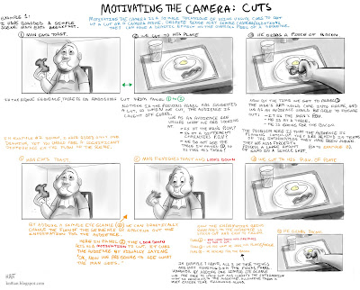
I think I made it a bit overly-complicated. Just look through each of the examples and feel the difference.
Basically: Use a character's eye line to motivate a cut. It helps ease the audience through the cut and into new information. (While also putting us directly in the character's shoes)
There are many other ways to motivate the camera. Below is a short sequence I've boarded out with various examples all strung together. The idea is to create as much continuity within the sequence as possible, making everything clear and easy to follow.
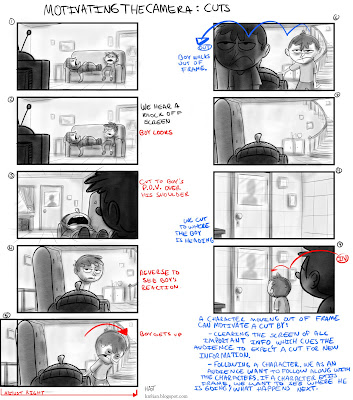 Below I have pointed out the specific methods used to motivate the camera.
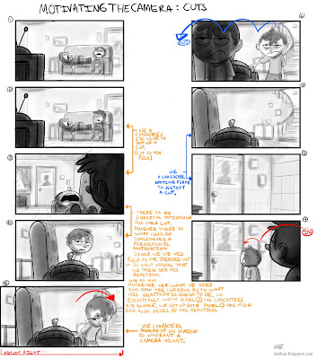 So as per the above sequence, ways to motivate the camera;
- Using a Character's eyeline/P.O.V.
- Having a character move on screen and adjusting the camera accordingly.
- Having a character exit frame.
There are other ways not represented in the above example, for instance;
- Having a character enter frame. (This will be illustrated in a future tip sheet.)
I think ultimately what it comes down to, specifically for 'cutting', is the fact that a 'cut' is not natural, it doesn't happen in real life (unless you take really long blinks). Obviously we have seen enough film/television that we are accustomed to 'cutting', nevertheless, anything you can do to smooth out the transition will only help create and maintain the continuity of your sequence.
To be continued shortly...
* Gold stars are neither gold nor stars and consist almost entirely of your imagination.
Motivating the camera is a simple technique of using visual cues to set up a cut or camera-move and in doing so, ease the audience into a new shot or new information.
Below is a simple example of how utilizing the above theory can have a huge influence on the overall feel/continuity of a sequence.

I think I made it a bit overly-complicated. Just look through each of the examples and feel the difference.
Basically: Use a character's eye line to motivate a cut. It helps ease the audience through the cut and into new information. (While also putting us directly in the character's shoes)
There are many other ways to motivate the camera. Below is a short sequence I've boarded out with various examples all strung together. The idea is to create as much continuity within the sequence as possible, making everything clear and easy to follow.
 Below I have pointed out the specific methods used to motivate the camera.
 So as per the above sequence, ways to motivate the camera;
- Using a Character's eyeline/P.O.V.
- Having a character move on screen and adjusting the camera accordingly.
- Having a character exit frame.
There are other ways not represented in the above example, for instance;
- Having a character enter frame. (This will be illustrated in a future tip sheet.)
I think ultimately what it comes down to, specifically for 'cutting', is the fact that a 'cut' is not natural, it doesn't happen in real life (unless you take really long blinks). Obviously we have seen enough film/television that we are accustomed to 'cutting', nevertheless, anything you can do to smooth out the transition will only help create and maintain the continuity of your sequence.
To be continued shortly...
* Gold stars are neither gold nor stars and consist almost entirely of your imagination.
Friday, November 5, 2010
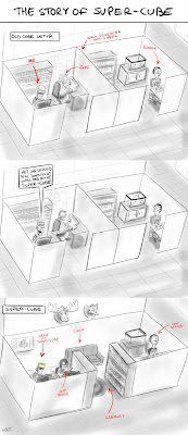
THE STORY OF SUPER-CUBE
Monday, October 25, 2010
I MISS HIM
Wednesday, October 13, 2010
STUFF I'VE LEARNED ABOUT STORYBOARDING: EPISODE #3
More storyboarding cheat sheets. This breakdown has to deal with screen direction, specifically characters moving in and out of frame.
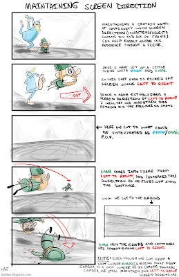
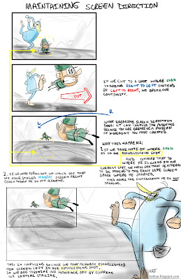
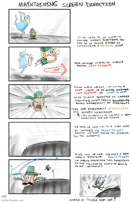
The folks over at The Art Center blog were nice enough to feature these little breakdowns I've been doing. Check out the blog if you've got time, there is a lot of great information there from a lot of incredibly talented industry professionals.
-Hat


The folks over at The Art Center blog were nice enough to feature these little breakdowns I've been doing. Check out the blog if you've got time, there is a lot of great information there from a lot of incredibly talented industry professionals.
-Hat
Friday, October 8, 2010
STUFF I'VE LEARNED ABOUT STORYBOARDING: EPISODE #2
Because of some nice comments on the previous post, I thought I would squeeze out number 2: Maintaining Screen Side
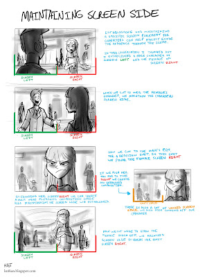 Note: there would obviously be more panels if this was flushed out, to play up the acting and also hook up the action. And on the last panel, I would probably frame it more centered while the female is farther away and then adjust right as she walks towards camera.
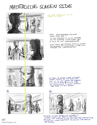
This is a simple theory of cutting that can easily help create a sense of continuity within a sequence and or exchange. The idea is not exclusive to 1 character interacting with another. The same principle can be used between 2 different groups of characters, or even a character and an object (Ie. A telephone. A man waits anxiously for a very important phone call).
The example above is a bit rudimentary for the sake of demonstrating the concept. More realistically, you will have characters moving around as they interact. In this case what we can do is create multiple patterns to track the exchange. The important thing to focus on when trying to handle multiple staging set ups is making sure the audience clearly sees our new staging occur. The simplest way to achieve that is by having characters physically cross paths on screen;
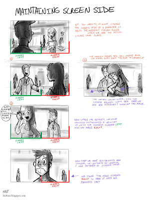 As long as you continue to establish any new screen spacing, the sequence should maintain a certain level of continuity that will allow the audience to follow along quite easily.
-Hat
 Note: there would obviously be more panels if this was flushed out, to play up the acting and also hook up the action. And on the last panel, I would probably frame it more centered while the female is farther away and then adjust right as she walks towards camera.
This is a simple theory of cutting that can easily help create a sense of continuity within a sequence and or exchange. The idea is not exclusive to 1 character interacting with another. The same principle can be used between 2 different groups of characters, or even a character and an object (Ie. A telephone. A man waits anxiously for a very important phone call).
The example above is a bit rudimentary for the sake of demonstrating the concept. More realistically, you will have characters moving around as they interact. In this case what we can do is create multiple patterns to track the exchange. The important thing to focus on when trying to handle multiple staging set ups is making sure the audience clearly sees our new staging occur. The simplest way to achieve that is by having characters physically cross paths on screen;
 As long as you continue to establish any new screen spacing, the sequence should maintain a certain level of continuity that will allow the audience to follow along quite easily.
-Hat
Wednesday, October 6, 2010
STUFF I'VE LEARNED ABOUT STORYBOARDING: EPISODE #1
Here are a few quick little tip sheets I put together for some of my friends who are currently doing storyboard tests and looking to get into boarding. I thought they might be worth posting here.
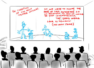
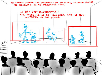
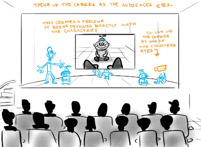
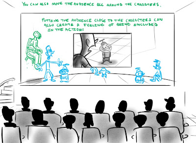
I think the most important thing to remember with storyboarding is that; anything and everything we can do visually will invoke a specific response from the audience. The key is to determine what exactly you want the audience to feel and then find the best way visually to achieve that reaction.
I hear a lot of people say "You can't do that cut" or "You are breaking the 180 line, you can't do that".... well obviously you can do it, because if you can draw it, you can do it. It's not that you "Can't" do something, it's that that "something" is confusing the audience, or isn't visually pleasing. Which are both appropriate critiques of a jump-cut or breaking the line, however not so much if that is the desired effect you hope to have on your audience.
There are no "right" or "wrongs" with storyboarding, only ways that work better than others. Figure out what you want to convey in a scene, and find the best way to present those ideas to your audience.
Wednesday, September 22, 2010
MANNY AND KHAN DANCE BREAK/UPDATE!
So a quick little Manny and Khan update;
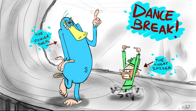
There was an awesome article written about Joey and his experience in the animation industry, spotlighting his involvement in co-creating Manny and Khan. Check it out yo;
http://www.buffalorising.com/2010/09/buffalo-cartoonists-project-is-on-the-rise.html
Some awesome fan also went and made a facebook page for Manny and Khan.
http://www.facebook.com/pages/Make-The-Awesome-Chronicles-of-Manny-and-Khan-A-Series-On-Cartoon-Network/149585578397870?ref=ts
Thanks to whoever it was who created the page, you're awesome. Manny and Khan could have never made their own page on facebook because they don't know what facebook is. And when they heard about it, they figured the way to join was by slathering their heads with paint and slamming their faces into a book. But they don't own books, so they used rocks instead. Needless to say, they have some interesting new artwork hanging up in the tree-fort. They're great conversation pieces. So if you like the short, you can join the facebook page and tell your friends about it. If you don't like the short, don't join the group and tell your friends you didn't join the group.
Umm what else.... the short is still up on youtube.
http://www.youtube.com/watch?v=wlvIB4jGpLo
That's all I can think of at the moment. Thanks to everyone who's shown interest in the short! You guys are AWESOME!
Well, that's all for now, as Manny and Khan say, "Awesome and out"
-Hat
Thursday, September 2, 2010
I LIKE YOU
Monday, August 30, 2010
FOX POSES
Just exploring an older character of mine.
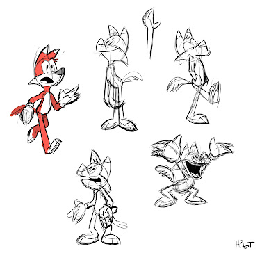
I've never settled on a specific design for him, and continue to explore his construction and proportions, especially within his head. Trying to figure out some of these shapes in 3 dimensional space is challenging for me, construction has never been a strong point of mine, so it's something I've been trying to build on.
I did these after copying a whole bunch of Freddie Moore Mickey model sheets.
-Hat
Monday, August 23, 2010
COLORED THREE EYE MOOSE
This is a quick little color/pose study I did for this moose I've been drawing. Nothings really final, color or design, but I'm kinda digging him. He is more fun to draw than a barrel of monkeys, because I suck at drawing barrels and monkeys.
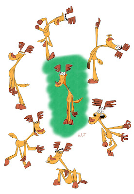
I wasn't sure if the color of his feet are drawing too much attention away from the rest of the pose? I had them gray, but that was even worse... What do YOU think? Any thoughts? Suggestions? Good recipes?
-Hat

I wasn't sure if the color of his feet are drawing too much attention away from the rest of the pose? I had them gray, but that was even worse... What do YOU think? Any thoughts? Suggestions? Good recipes?
-Hat
Sunday, August 22, 2010
Friday, August 20, 2010
Wednesday, August 18, 2010
RANDOM SHTUFF
Thursday, August 12, 2010
Sunday, August 8, 2010
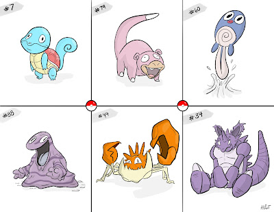
RANDOM POKEMON TEAM
Took a page out of Ian Andersen's blog and used a random number generator to come up with 6 numbers. Then I drew them;
 -Hat
-Hat
 -Hat
-Hat
Friday, August 6, 2010
Thursday, August 5, 2010
OH MY GOSH CAN YOU BELIEVE IT MORE POKEMON
S'MORES POKEMON
Monday, August 2, 2010
Subscribe to:
Comments (Atom)


