Below is the model sheet for Gnome we put in our pitch packet. His design stayed relatively close to the first few concept drawings I did, and over a 6 month period of re-drawing and tweaking, it was boiled down to the economic state seen below. I was lucky enough to have Andy Bialk, a very talented artist and super nice guy, look at the first few passes of Gnome at which point he made some great suggestions, specifically on ways to unify the overall graphic/flat style of the form.
I think Gnome's probably the best character design I've done to date.
Earlier design (for reference):
The short formally known as:
PS: The 'BFF' stands for 'Best Fucking Friends".
We also did a few little vignettes, scenes from some of the episode ideas we came up with, to give the guys a feel of the show.
Sunday, June 22, 2008
Sunday, June 15, 2008
THE NOT-SO BIG FOOT ANYMORE
This is a rough model sheet I put together for the original Big Foot design we pitched with. However after some advice from Craig McCracken and Rob Renzetti, Joey and myself chose to go a different direction with the character.
There is no denying the foot print this character has left in the back of my head, as it was incredibly hard to have to let go of him. This being my first official pitch, there have been a myriad of new circumstances/check points I've had to face all in the path to creation. Chopping off Big Foot was one of the hardest things I've had to do as an artist, having developed something to a point of supposed perfection, to have someone tell you to change it. Thankfully, it came from two people I have the utmost respect for, and their advice and reasoning was entirely genuine. I can say now (after a week of creative straining trying to come up with a new character) that I am ultimately happier with the new approach we've taken. I can look back now at the footprints I left behind and, despite them getting smaller, know that I've grown.
Saturday, June 14, 2008
HOW TO PAINT YOUR DRAGON
So I was sitting outside a coffee shop in downtown Burbank, as I often do, drawing, when a nice chap, the old milk-man type a' guy came up and said he'll pay me to draw him a logo for his hockey team. I said sure. We didn't really talk about what it should look like, just that; 1. It's a dragon. 2. Hockey sticks. and 3. He should have pectoral muscles.
So here is my Ice Dragon, notice the peck juice.
Thursday, June 12, 2008
GNO MORE GNOME
I recently had a chance to pitch an idea to Cartoon Network with my good friend Joey Giardina for a shorts program they are currently producing. We were able to pitch directly to Craig McCracken and Rob Renzetti, two people who have already had a long lasting impact on my so-far short lived career and of whom I have the utmost respect for.
They were very receptive to the idea and very genuine with their feedback. They liked the general tone of the short, the personalities and the relationships and offered some insightful suggestions that both myself and Joey are taking to heart. We are in the process of retooling our concept and pushing ourselves creatively to give the short as much potential as we possibly can. With that said, here is a small sample of the rejected rethinkings of what was once Big Foot and Gnome.
I'll be posting a lot more of BF and G related artwork in the next couple weeks.
Monday, June 2, 2008
BF ALT_1 (IT'S CODE)
This character is based on an old Big Foot concept design i did, that I recently re-stumbled upon. I like the design so I started doin some drawings with him. He suits himself well to actiony poses, which is fun cause I normally don't get much action.
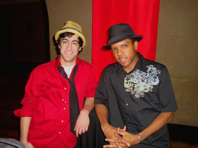
Also I need to give a shout out to my main man Jabari Phillips; Dreamworks Script Coordinator extroidinaire for getting me in to the premier of Kung Fu Panda. He's an incredibly down-to-earth person with a good head on his a shoulders and even nicer hat on his head.
Kung Fu Panda is awesome, it's a must see as far as I'm concerned. Best looking CG film to date and some of the best action scenes I've ever seen.
Subscribe to:
Posts (Atom)