I posted this on the art center blog a few days ago, forgot to put it up here.
These next few tip sheets examine the elements of design; line, shape, space and value, and how to incorporate them into your storyboards to help direct the eye and clarify information. The focus here is not the cinematics of stroyboarding but the execution of idea to paper and ultimately how to utilize design principles to achieve desired results in an efficient way within a given panel or shot. Storyboarding is not necessarily about drawing 'good' but drawing effective.
NOTE: There are two other elements of design, texture and color. However they would only be used in rare cases with storyboards and when employed probably wouldn't be for design purposes but most likely for clarification (I.e. using colors to keep track of specific objects of similar size and shape in a given sequence, such as stones or gems, that each have varying story-specific trajectories).
Below are a few examples of how incorporating varying line thickness into a panel can help clarify not only the information presented, but the depth of the shot.  There are many things you can do within a given panel to help focus or direct the eye to the important information. A simple way to achieve this is through contrast. Contrast can exist in many forms, and below we look at how contrast within a specific design element (shape, space, value) can create a focal point.
Now we can take these principles and incorporate them into storyboard panels.
 I got a bit 'wordy' on the tip sheet above. I think the most important thing to take away from the sewer-rat example above is realizing that even though panel 1 and 3 are the exact same compositions, the shading can either greatly enhance (1) or greatly distract (3) from the important information. This holds true of the other design principles as well. Thinking about these principles while you are boarding can help in creating clear and easy to read compositions.
Storyboards, by nature, are disposable. They are not finished pieces of artwork. The main goal is to present ideas on paper quickly and clearly. Design principles can help sell ideas very effectively in storyboards. Below are a few more examples;

There is no single 'right' way to present an idea visually. The 'blimp' idea, for instance, could easily be boarded successfully in a variety of different ways. Ways that would vary in stylistic choices based on the artist, but that could all achieve the same goal of focusing the attention on the blimp. In fact there are probably compositions that could be more successful than the one presented.
So start experimenting with design principles and find ways to incorporate them into your boards that work for you.
As per my previous posts, I reserve the right to be wrong. These are simply tricks and tips I've picked up along the way that I've found to be successful in my own work.
-Hat





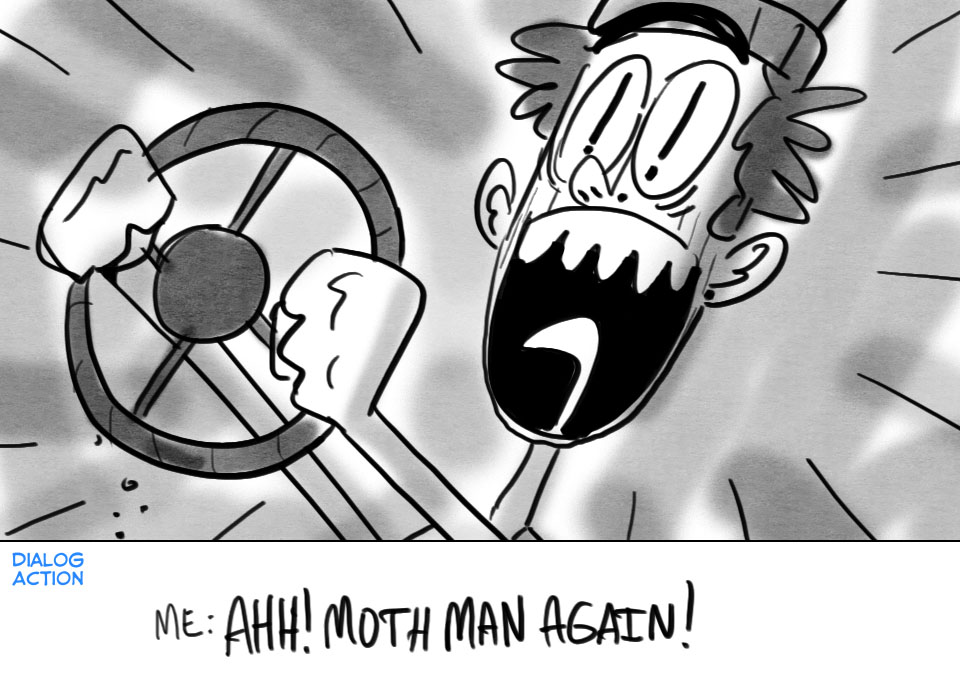


 There are many things you can do within a given panel to help focus or direct the eye to the important information. A simple way to achieve this is through contrast. Contrast can exist in many forms, and below we look at how contrast within a specific design element (shape, space, value) can create a focal point.
 I got a bit 'wordy' on the tip sheet above. I think the most important thing to take away from the sewer-rat example above is realizing that even though panel 1 and 3 are the exact same compositions, the shading can either greatly enhance (1) or greatly distract (3) from the important information. This holds true of the other design principles as well. Thinking about these principles while you are boarding can help in creating clear and easy to read compositions.


 Conceptually, it is a good.
  Laying down your grid is something that's been pounded into my head by almost every feature board artist I've ever worked with. It'll help clarify your depth, and can be used as a guide for incorporating mid/forground elements (illustrated in Step 5.)
 By pushing the depth, bringing one character closer and pushing one further away, you can create a much more engaging composition, as well as utlizing the real estate of the panel more effectively.
 The important information in the above panel is the charatcers, so everything else in the composition should support that. Keeping that in mind, we can use mountain ranges in the background to help lead the eye to the character.
 Populating the mid-ground can help in a few ways:
 I did a quick shade pass over the panel using each object's relative position in the composition, how close/far away it is from us, and shaded accordingly.
 With storyboarding it is just a matter of getting sequences under your belt, the more you board, the better you get, plain and simple. Don't be discouraged if you don't see immediate improvement. It takes time for these principles to become second nature, the most important thing is that you are aware of them and how they can affect your work.
 check out;
 Check out all the others yo;


 -Warm Hat
 -Hat
-Hat
 -Hood Hat
 I did a version that I had shaded, but liked this one with the flat color better.
 He has crafted, with Pokemon in particular, a style that is beautifully minimalistic yet complex at the same time, specifically in the anatomy, which contains brilliant subtleties all while maintaining the overall appeal. The hierarchy of details in his designs is unmatched. He has an uncanny ability in understanding where high volume areas of detail, as well as low volume areas, need to be in order to suggest types of fabric/skin/fur all without drawing attention to itself and distracting from the overall harmony of the design.


 Below is the clip, the first 35 seconds is the stuff I boarded. The animation team did an amazing job matching and enhancing the poses and shots I boarded.
 Some 1 and 2 minute gesture drawings;
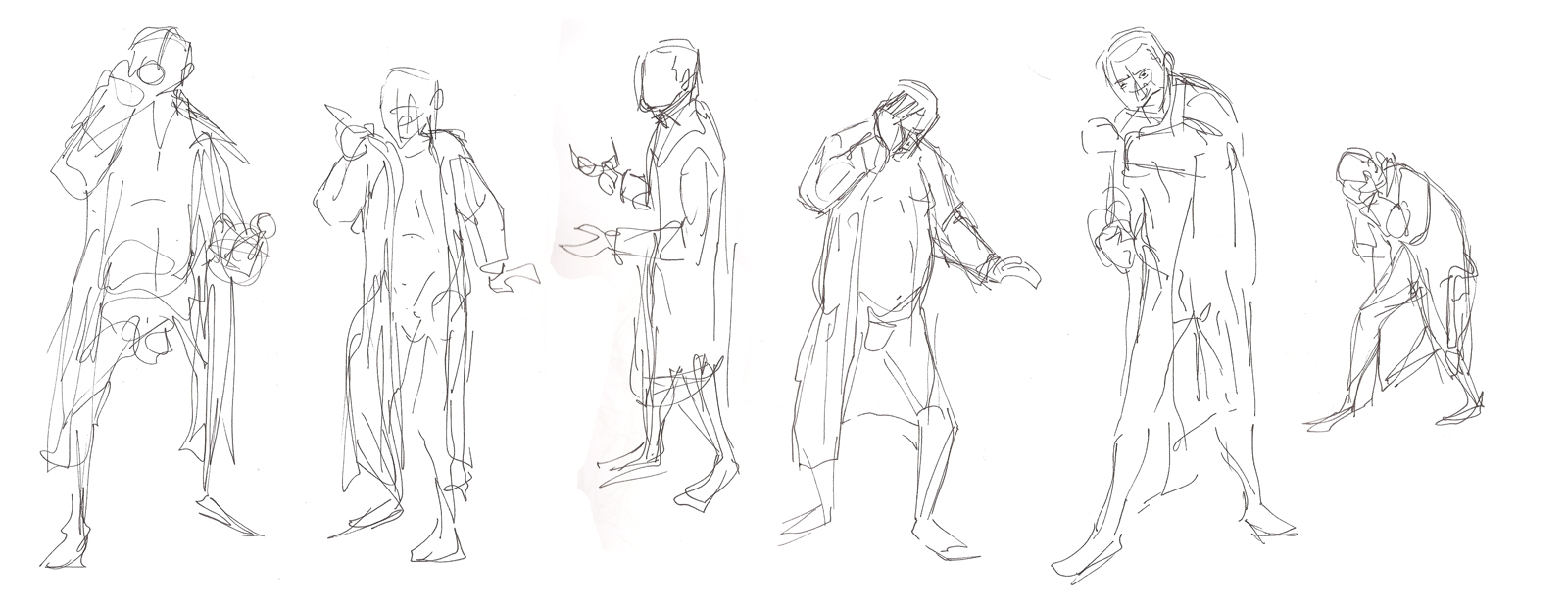 Random sketch book page;
 A couple caricatures I did for and of some dudes at the studio;

 Thanks to all the peoples who stopped by my blog this past year, you are awesome. I hope this year I get a chance to meet some of you that I only know by artwork.