 If you like it, there are super cool Prohpet Buddy shirts available for purchase, I bet they make great christmas presents, but what do I know, I'm a jew. Anyways, check out Prophet Buddy.
Tuesday, December 11, 2007
I SEE PROPHET BUDDY IN YOUR FUTURE
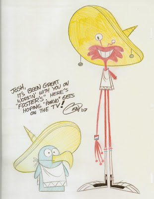
Prophet Buddy is an online animated series by a buddy of mine Eric Pringle. He is one of the best flash animators around, and Prophet Buddy is some of the best flash animation on the web. I highly recomend giving it a watch.
 If you like it, there are super cool Prohpet Buddy shirts available for purchase, I bet they make great christmas presents, but what do I know, I'm a jew. Anyways, check out Prophet Buddy.
 If you like it, there are super cool Prohpet Buddy shirts available for purchase, I bet they make great christmas presents, but what do I know, I'm a jew. Anyways, check out Prophet Buddy.
Sunday, November 18, 2007
PHOTOSHOP FUN
This is another piece inspired by the artwork of Shane Prigmore. I'm trying to get a lot more comfortable with photoshop. I'm going to need it a lot when I start working on the Deese Nuts shorts.
I don't know that he's necessarily a bear?

I don't know that he's necessarily a bear?

Thursday, November 15, 2007
BEAR CLAW IN THE HONEY JAR
I was just messing around in photoshop, did this little piece. It was inspired by the artwork of Shane Prigmore. He's a super talented character designer.


Friday, November 2, 2007
CHECK OUT DEESE NUTS
These are some character designs I did for a project being pitched to adult swim, The Legend of Deese Nuts. I got to work with some really cool guys, they gave me a lot of creative freedom and I'm super happy with the outcome (Especially beacuse I don't draw human characters?).
The website is up, Deesenuts.com but it's still in the priliminary stages. There is a whole merchanidsing line (including nut sacks), and a lot more to come in the future as we plan to integrate the new designs in.


We're going to make some flash shorts in the near future. Hopefully the project will take off, its pretty hillarious, and I enjoyed working with these guys so much.
The characters are still subject to change, these are very concept, so I'd love any feedback you can offer? (I won't be mad if you hate them.)
The website is up, Deesenuts.com but it's still in the priliminary stages. There is a whole merchanidsing line (including nut sacks), and a lot more to come in the future as we plan to integrate the new designs in.


We're going to make some flash shorts in the near future. Hopefully the project will take off, its pretty hillarious, and I enjoyed working with these guys so much.
The characters are still subject to change, these are very concept, so I'd love any feedback you can offer? (I won't be mad if you hate them.)
Sunday, October 7, 2007
Thursday, October 4, 2007
FOSTER'S HOME CHARACTER TEST
When I was interning on Foster's they gave me a character test as an excersize. I didn't like any of the stuff I came up with on my first pass, so I tried again. This is what I came up with.
Craig McCracken has had such a huge influence on my style, especially my work post-internship. I find myself doing a lot of; eyes lying flat on the head, and not overlapping. As opposed to say, Spongebob-esque opticals, which, about 4 months ago, I would draw for every character.

Below; Eye's flat on head/body. No overlap.


Above: Eye's have volume. Overlap.
Craig McCracken has had such a huge influence on my style, especially my work post-internship. I find myself doing a lot of; eyes lying flat on the head, and not overlapping. As opposed to say, Spongebob-esque opticals, which, about 4 months ago, I would draw for every character.

Below; Eye's flat on head/body. No overlap.


Above: Eye's have volume. Overlap.
RATS
Saturday, September 22, 2007
UNLUCKY BUNNY
These are stills from a new short I'm working on. I'm really happy with how these scenes came out. The whole short was inspired by Eric Pringle and his new "Strips" Prophet Buddy (Here's the blog; http://prophetbuddy.blogspot.com/.
I got a chance to meet Eric during my internship on Foster's Home. He's the animation supervisor for the show and one of the sickest flash guys around (and he uses a mouse! (like me)), not to mention, a really cool guy too . His new "Strips" are really funny, and the animation is fun-credible. So with those as inspiration, I set out to make a quick, simple short (Not that Eric's are simple). However, as usual with my projects, I get carried away and they take on a life of their own, and I end up planning an epic of... epic porportions. So it looks like its gonna take a while, but i'm really excited about it, so hopefully I'll be able to keep the motivation up.

 Any advice? Comments? Hate mail?
I got a chance to meet Eric during my internship on Foster's Home. He's the animation supervisor for the show and one of the sickest flash guys around (and he uses a mouse! (like me)), not to mention, a really cool guy too . His new "Strips" are really funny, and the animation is fun-credible. So with those as inspiration, I set out to make a quick, simple short (Not that Eric's are simple). However, as usual with my projects, I get carried away and they take on a life of their own, and I end up planning an epic of... epic porportions. So it looks like its gonna take a while, but i'm really excited about it, so hopefully I'll be able to keep the motivation up.

 Any advice? Comments? Hate mail?
Tuesday, August 28, 2007
FOSTER'S HOME BOARD TEST
This is a storyboard test I did for Fosters. Not for a job really, but for my portfolio, a lot of the artists recomended doing it, to show 1. Your sense of boarding and 2. how you handle other people's characters.
I showed them Craig McCracken, he thought they were pretty good.


 Ben Balistreri gave me some good advice on it, so I changed a few things, and would probably change some more. Below is a picture that Ben drew for me, It's awesome. He's one of the best artists i've ever seen. I learned a lot from him this summer.

I showed them Craig McCracken, he thought they were pretty good.


 Ben Balistreri gave me some good advice on it, so I changed a few things, and would probably change some more. Below is a picture that Ben drew for me, It's awesome. He's one of the best artists i've ever seen. I learned a lot from him this summer.
I DUNNO'
Tuesday, August 21, 2007
PANDORA POSTER DESIGN CONTEST
Here's a poster design I did for a contest on this music site; pandora.com It's a pretty cool website.
 You can vote for the entries here;
http://blog.pandora.com/poster/
 You can vote for the entries here;
http://blog.pandora.com/poster/
Tuesday, June 12, 2007
JOSH'S BLOG FOR PRELIMINARY DRAWINGS
Monday, May 28, 2007
Some Wilts... Is that ok? I'm sorry.
A few Wilt's I've done. I've had a crazy week, and another ahead, so not too much time to draw. I'm moving out to Burbank on thursday. I've got an internship this summer out there.
I'm also doing some freelance work for an independant animated feature, so it's gonna be a lot of work, but this is what I want to do the rest of my life and I can't wait to get started.
Wilt was pretty fun to draw, a little tricky at first, but once you get the porportions down, he's pretty simple. It's crazy how small his body is compared to head, I never really noticed until I drew him.


Tuesday, May 15, 2007
Coco.... Co Coco
Some Coco's I did.
I wasn't really having fun drawing her so i stopped. She was pretty easy to draw actually, easier than I thought she would have been, except for the hair/tree-top, a bit tricky.


During class I did some Foster's doodles. I didn't have any references, so I was pretty happy with how they came out, seems like i'm retaining the characters pretty well.

I wasn't really having fun drawing her so i stopped. She was pretty easy to draw actually, easier than I thought she would have been, except for the hair/tree-top, a bit tricky.


During class I did some Foster's doodles. I didn't have any references, so I was pretty happy with how they came out, seems like i'm retaining the characters pretty well.

Monday, May 14, 2007
BIG MAC
Saturday, May 12, 2007
INSPIR(ED)
Friday, May 11, 2007
Guess Bloo?
Some studies I did of Bloo.
One of the pages are original pose and expressions, I think its pretty obvious which one, but hoepfully not.
 I switched to blue pencil after the first sheet... for obvious reasons. I like blue pencil more every time I use it, its a lot cleaner than graphite.


Alternative titles for post;
One Friend, Two Friend, Red Friend, Bloo Friend
One of the pages are original pose and expressions, I think its pretty obvious which one, but hoepfully not.
 I switched to blue pencil after the first sheet... for obvious reasons. I like blue pencil more every time I use it, its a lot cleaner than graphite.


Alternative titles for post;
One Friend, Two Friend, Red Friend, Bloo Friend
Wednesday, May 2, 2007
FLAM AND HOPPER (FORGOT ONE)
Just realized I had an older pic I never posted. I wouldn't really make a big deal to post it, except I love the top pose, where Flam frames Hopper. That pretty much sums up what I was trying to do with these characters. Fit them together in unique ways, and explore expressions.
 I tried to take John K's approach in never drawing the same expression twice.
 I tried to take John K's approach in never drawing the same expression twice.
Sunday, April 29, 2007
BOARDING SCHOOL (PART 2 OF 2)
Subscribe to:
Comments (Atom)


